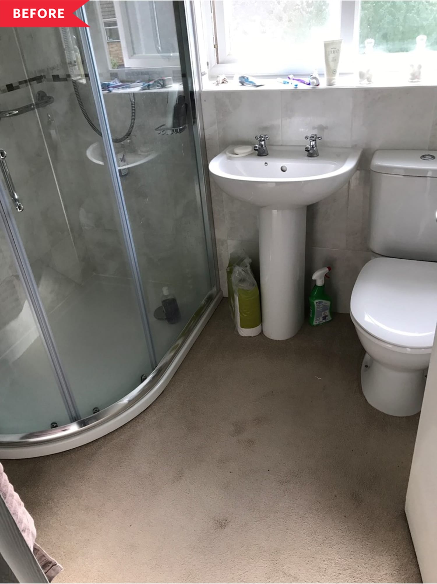
No matter how functional they may be, dated finishes can really drag a space down. For Mohamed Hussen (@mo.and.the.jungle.shelf), the roomed that caused some of the most problems in his 1970s home was the bathroom. “The ironic thing was that the bathroom was the only room that had been done in the last 40 years, by the previous owners,” Mohamed says. “It had a new beige tiles, a new white suite, a new but hideous corner shower cubicle, and a gorgeous beige carpet to match. I don’t know how something so new could look so dated.”
Mohamed knew when he moved in that every piece of the 1970s home would need some love. “I don’t think I’m one of these people that could sit in a house and look at someone’s tile choices, or someone’s carpet or paint choices,” Mohamed says. “I need to put my stamp on the place.”
The bathroom got high priority since it’s such an important space to Mohamed: “I love spending time in the bathroom, but a dated bathroom—no matter how new—just made me glum,” he says. “The bathroom and kitchen to me are so important— my inspiration often comes to me in these two rooms!”
One challenge in redoing the bathroom was its small size, but Mohamed made it work. He hired pros for the job, and they started with tearing out the old carpet and replacing it with black-and-white patterned tile on the floor. “In our last house, which we completely refurbished also, we played it safe in terms of floor tiles,” Mohamed says. “This time around, we wanted to go a little bolder, but still keeping it classy—so we picked quite a modern tile, but still understated. A bit of a wow factor but not something way out there.”
To replace the pedestal vanity, Mohamed chose a classic cabinet vanity in a subtle gray color. It takes up about the same amount of room as the old sink, but provides more storage underneath—a smart addition in a small bathroom.
The shower also got a total redo, with a new sleek rectangular shape, classic oversized subway tile on the walls, and black-framed glass doors. Mohamed had shower shelves added that he filled with plants, which bring some color and life to the small bathroom. “I love everything about it, but particularly the fact we could have some plants in the bathroom—a whole wall devoted to them!” Mohamed says.
He also got a smart idea for later: “If I could re-do the room, I’d change the window by making it smaller,” Mohamed says. “After we’d done ours, we saw a neighbor bricking up half the window, freeing up some precious wall space. I thought what an amazing idea—we’ll remember that for the next house.”
In the meantime, though, Mohamed offers a money-saving trick that helped him save on materials and fixtures for this remodel. “A trick that worked for us with, not just with the bathroom, was adding the products to our shopping basket after registering, and then not continuing with the order,” he says. “In almost every case we were emailed a discount code that saved us hundreds of pounds.”
Inspired? Submit your own project here.
tinyurlis.gdv.gdv.htu.nuclck.ruulvis.netshrtco.detny.im
مقالات مشابه
- شرکت های هواپیمایی می خواهید رهایی از پرواز در نزدیکی خالی هواپیما به عنوان تعداد مسافر آمار پایین ترین سطح از 1950s در میان ویروس
- درمان سرطان تیروئید
- Nirmala Sitharaman اصلاحات در بهداشت و درمان MNREGA: برجسته
- "ما انجام داده اند می تواند بسیار بهتر": آمیتا کانت در مهاجران
- Coronavirus زندگی می کنند به روز رسانی: کالیفرنیا می گوید: راهنمایی برای بازگشایی ورزشگاه به زودی بزوس دفاع ایمنی رکورد
- Trinamool MLA Tamonash Ghosh, 60, می میرد در بیمارستان است. او آزمایش مثبت
- رهبران اروپایی شروع مذاکرات بیش از یک محرک های مالی طرح
- یک کتابدار مدرسه است ارائه کتاب به دانش آموزان خود را از طریق هواپیماهای بدون سرنشین
- علی Raisman رفته از المپیک مدال طلا به گیاه گورو
- سهام مجموعه به تجمع دوباره در خوش بینی در مورد اقتصاد بازگشایی داو آتی پرش 300 امتیاز