SPONSORED POST: 4 Apartment Therapy Staffers Asked You to Design Their WFH Spaces — The Results Are In

Just like everyone else who’s been working from home for most of this year, lots of us here at Apartment Therapy realized our WFH spaces could use a little attention as soon as we started spending eight hours a day in them. And while we always try to help you with fixing up your space, this time, it was you who came to our rescue! We asked our Instagram followers to vote on colors and patterns for four of our staffers. The selections came from the BEHR® Color Trends 2021 Palette which is all about elevating the new normal and bringing a sense of calm into our homes. Now, the results are in! Here’s a look at how your selections played out. (And PS — thanks for the help!)
Erin, Associate Art Director
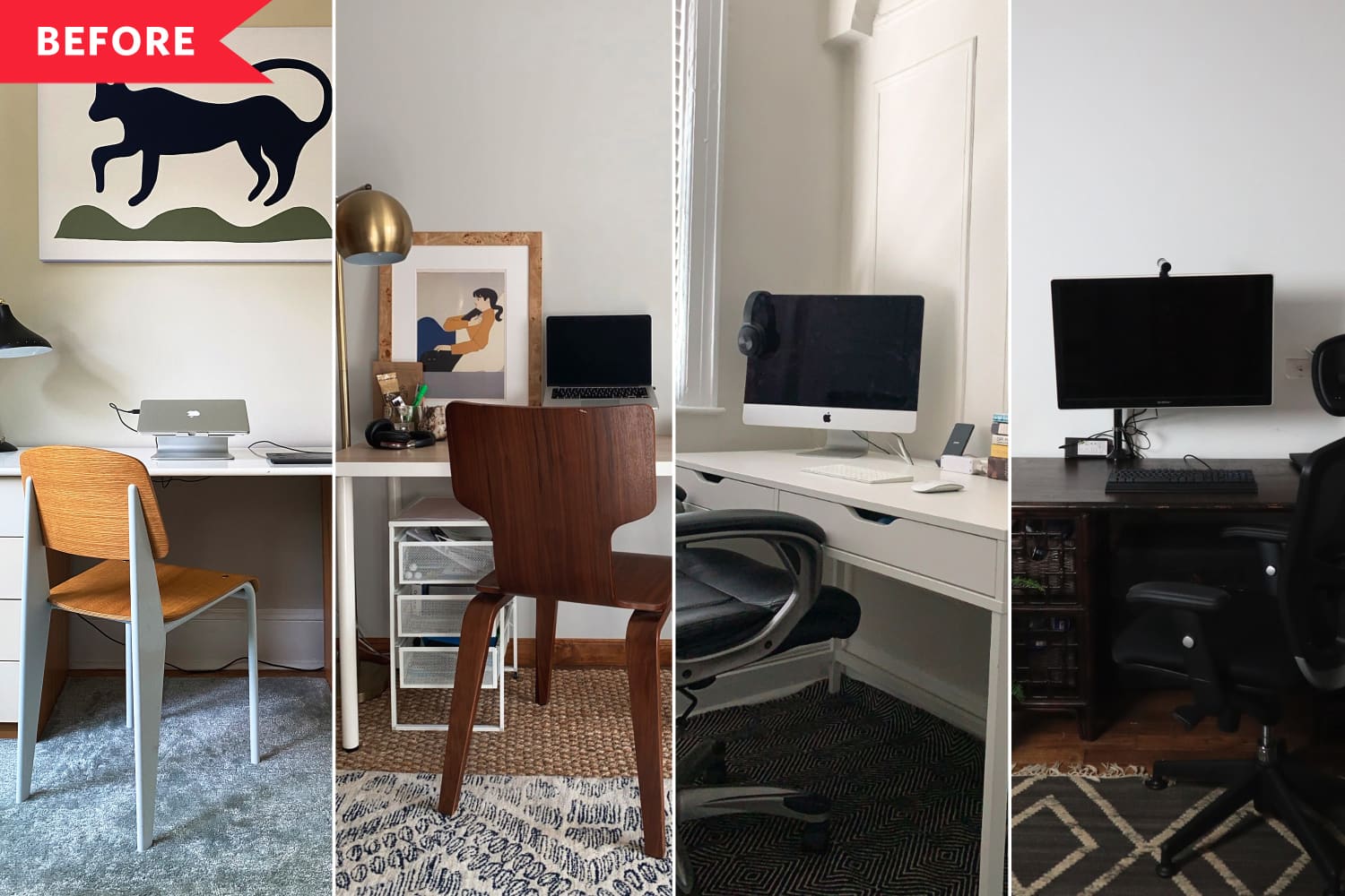
Erin lives in a house that’s over a century old but loves clean and modern design, so she was looking for colors that could help bridge the gap between old and new. You chose Jojoba N390-3 to make her space feel calm, cool, and collected, all while making her focal point — that cool panther print — come alive. The color is part of the “Casual Comfort” theme, a collection of light and cozy neutrals that update the casual farmhouse look.
Brittany, Project Manager
Brittany wanted to turn her WFH space into its own space, one that’s distinct from the rest of her home, but her overall paint style is also relatively neutral. With that in mind, you chose Voyage PPU13-07, which helps delineate her office space from the rest of the home while staying in tune with the relaxed vibe of the rest of her space. The color is part of the “Calm Zone,” an appropriately named design theme of nurturing greens and blues that create restorative spaces.
Marisa, Consumer Insights & Sales Manager
In general, Marisa steers clear of color, so she was looking for some help to make the leap to a more colorful WFH space. And that she did, with a circular accent painted with Royal Orchard PPU11-01 by BEHR Paint. It makes a bold statement, but it doesn’t interfere with the rest of her space at all. This is one of the colors from “Quiet Haven,” a design theme that tells us the dark, evocative rooms we’ve been seeing for years are becoming even more stylish now.
As our own Home Director, Danielle is obviously a pro when it comes to color. But…she told us her WFH space needed a bit more personality. You chose Wishful Green M410-2 to bring in a touch of whimsy and an optimistic vibe to her space. Like the rest of the “Subtle Focus” design theme it represents, it’s a soft pastel that’s a little Art Deco and a lot of fun.
tinyurlis.gdv.gdv.htu.nuclck.ruulvis.netshrtco.detny.im
