Before and After: A Bare Hallway Gets a Stunning Gallery Wall Glow Up

We independently select these products—if you buy from one of our links, we may earn a commission.
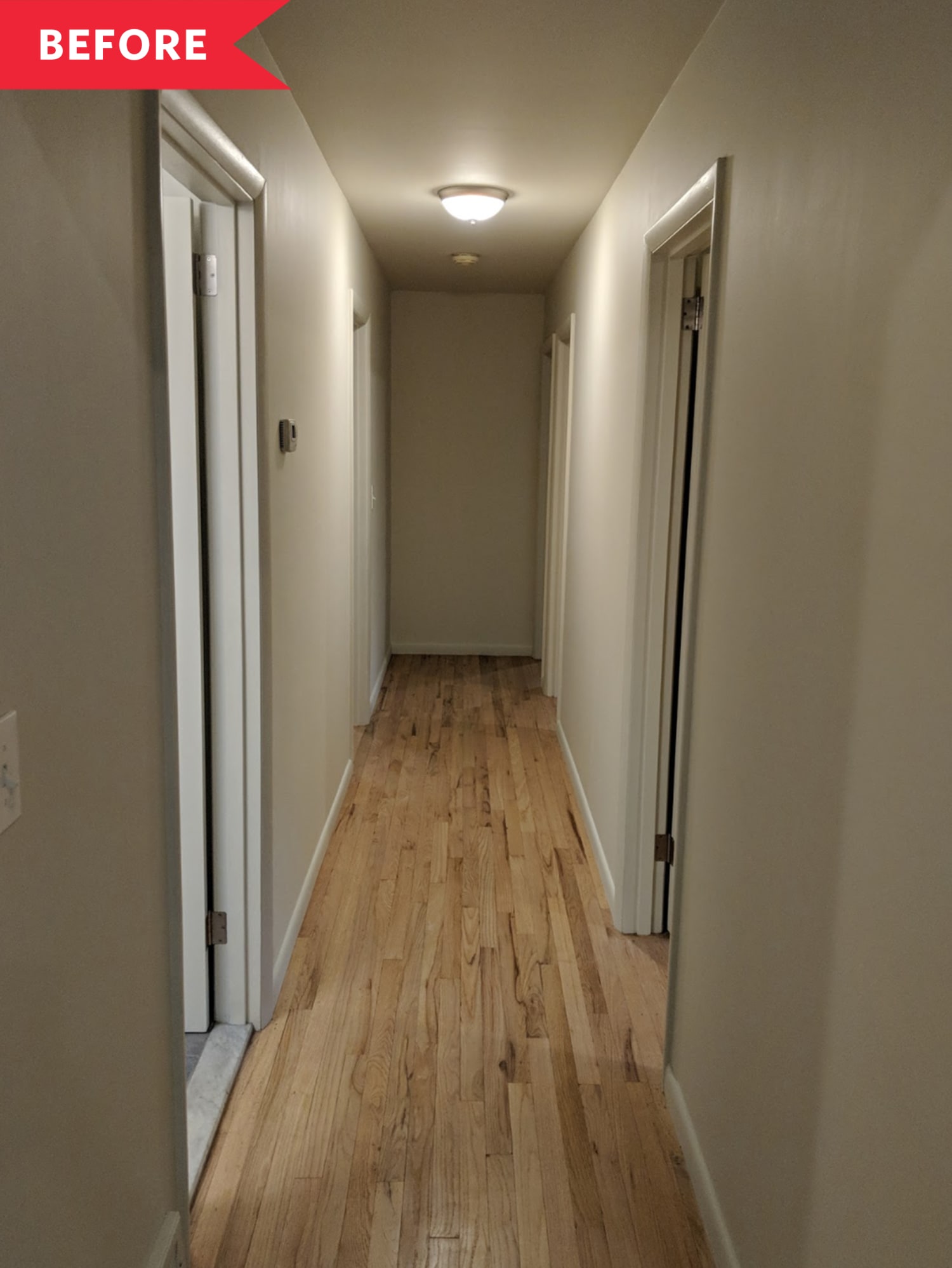
Designer Crystal Sinclair had just the right project in mind when it came to transforming a long, bare hallway in her Tuxedo, New York, home. With its white walls, dim lighting, and bare floors, this transitional space, which leads to two bedrooms and her home office, had absolutely no personality. So how did Sinclair take it from blah to brilliant? She turned the entire thing into a high impact, grid-like gallery wall installation of photographs, which is quite the feat considering the fact that the two side walls are a whopping 21 feet long.
Sinclair now calls this area the “Hall of Fam,” and it features 116 color family photos in chronological order from when she and her husband married in 2011 until present day. “I’m all about finding a fun way to work around a budget,” she says, and certainly, filling these walls with this many paintings or prints would be way more expensive. In her previous home, she had hung many of these photos on bulldog clips. So when her family moved into this house in March of 2018, she was ready for something a bit more polished. A gallery wall in this spot seemed like the perfect place to give these memories (including the arrival of her daughter, Mira, now two-and-a-half) a proper, prominent home.
She saved by finding simple white frames at Michael’s, which she amped up with asymmetrical matting, and added structure to the ever-expanding wall of photos with a painted rectangular backdrop. “I didn’t want the frames to feel like they were floating in the hallway,” she says. To achieve the photos’ rich caramel base, she custom blended two earthy Benjamin Moore shades. Even the doors got a much-needed makeover with a coat of Benjamin Moore’s Jet Black, which adds further contrast to the space. A graphic, 18-foot long, black-and-white runner from Etsy works together with the lines of caramel paint to make the hallway seem even more expansive.
Undoubtedly, the most special element of the hall is the collection of family photos, but leave it to an interior designer to put an exclamation point on this very personal project: a neon sign reading “You Are Here” from Vida Signs mounted at the end of the hallway. “I love how it plays off of the actual location of where you are in this hallway—and where we are in life,” she says. When the lights are off, the sign totally illuminates the hallway, and the frames dramatically reflect its glow.
For Sinclair, the biggest challenge was figuring out the spacing for hanging the photos. While she admits a photo or two might be off, the project came together relatively easily over just a few weekends. As the years pass, the hallway will certainly continue to evolve, with new photos coming in and maybe even additional rows of snapshots being added. One thing’s for sure though: This hallway is no longer dull and dim—day or night!
tinyurlis.gdv.gdv.htclck.ruulvis.net
